Freebites App Redesign
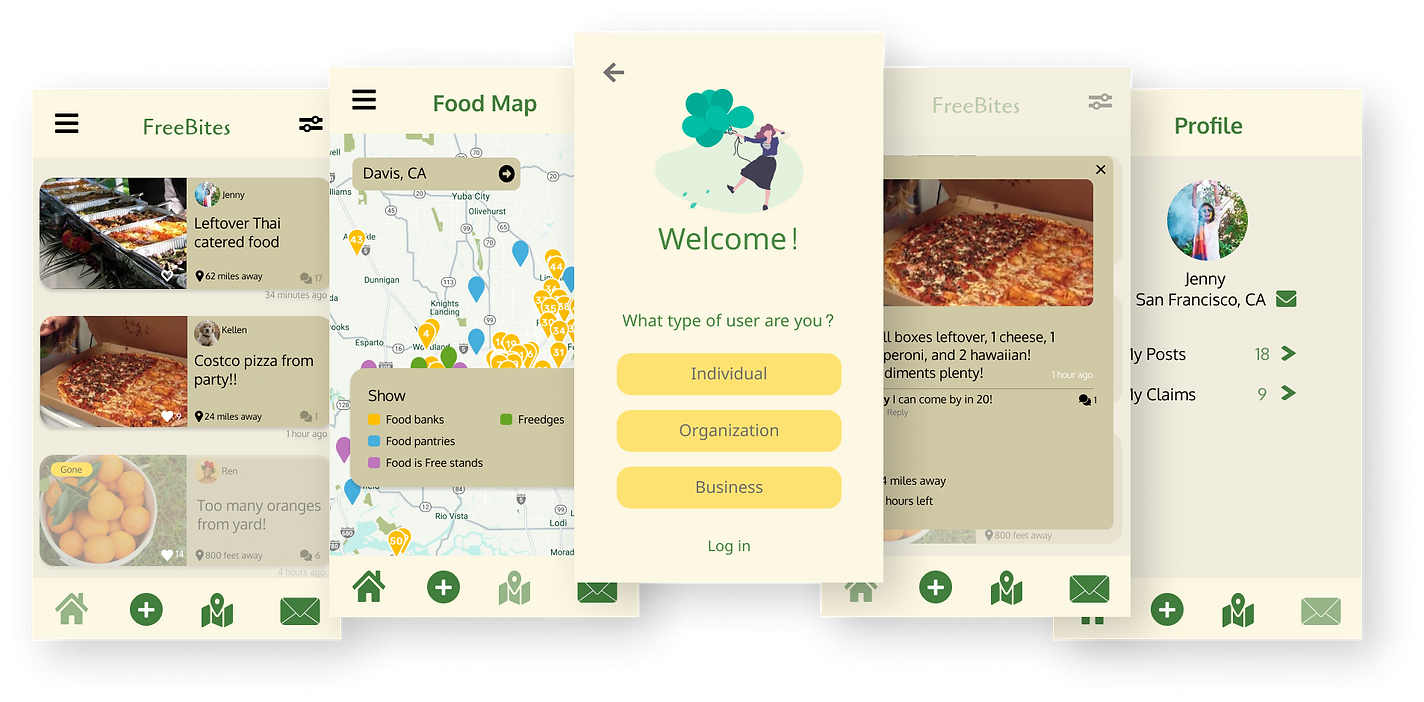
Redesigning the UC Davis startup app, Freebites to help make the process of sharing free food more user friendly.

Redesigning Freebites
Overview
Freebites is an app built by students from UC Davis that aims to aid food insecurity and reduce food wastage through connecting students with surplus food in the community. Our client, Kim Quach, sought out our help with the objective of redesigning the Freebites app to maintain a more coherent and visually appealing UX and be more community-focused by expanding the target audience to the entire Davis community rather than just students.
Project Type
Client Project / UX Design
Client
Freebites
Role
UX Designer
Skills
UX Design | Prototyping | Wireframing | UXR
User Research
Understanding the Freebites audience
Research Goal
Identify the different types of users that might use the app with the expanded Davis community focus, and redesign the winter launch to fit those user goals and needs.
Users and Audience
We identified three main users:
Students (looking for free food opportunities)
Surplus sharers (anyone looking to share leftover, excess food)
Organizations
Process
To understand our target users better, we each conducted user interviews with multiple people to receive an in-depth understanding of their roles and outlook on food insecurity. We also took them through a series of tasks to evaluate how they interact with and perceive the Freebites app.
01
What we learned
Upon conducting user interviews with students, surplus sharers, and nonprofits, we found that the lack of sufficient communication to the user seemed to be the most apparent issue throughout each person’s experience.
Pain Points
1. Communication issues when obtaining food such as how food would be distributed to large crowds, lack of information based on misaligned expectations, and safely receiving food in marginalized communities.
2. For the food secure, or those sharing leftover food, many interviewees felt they had insufficient information throughout the food sharing process (e.g it was difficult to know how many people may arrive to pick up food, what time people would arrive to pick up food, if people had any important dietary restrictions, etc).
ANALYZING OUR LEARNINGS
Our insights made it clear to us that we needed to streamline the process of sharing food on Freebites so that enough sufficient information is provided such that people and organizations are able to distribute and collect food easily, while keeping the app simple to use.
Guiding Question
How can we streamline the Freebites food sharing experience so communication within the food community is more intuitive, cohesive, and accessible?
Ideation
Synthesizing our key insights from research and imagining the optimal solutions
02
Focusing on the pain points we uncovered for each user type, we brainstormed which features & processes within the app needed improvement. Two questions we asked along the way: “How can we improve existing features based on our research insights? How can we distinguish ourselves from competitors?”
Methods
Competitive Analysis
Storyboarding
Affinity Mapping
Solutions
Based on our insights from storyboarding, affinity mapping and creating user flows we came up with some broad solutions for our app’s features and interface. We would be changing the app’s navigation to consist of a home feed with a new notifications tab, a food map page, a messages page and a redesigned profile page that allows users to reference posts they have saved. All of these features will be implemented with the goals of providing enough information and guidance and reducing the confusion.
Prototyping
Creating lo-fidelity mockups and conducting usability testing.
03
As a team we created lo-fidelity mockups of what we envisioned the redesigned Freebites interface to look like, with the features we thought were most important to include based on our research. We conferred with our client, Kim Quach, to communicate our design decisions and make sure they were viable for her team to develop.
Mid-fidelity
Having determined what the final composition of the redesigned Freebites app would look like, we moved forward developing the Freebites interface further, adding more content and visual elements to make our app look closer to the final product. At this stage, we conducted usability testing to see how people felt about our redesign.
Key findings from usability testing:
Users were generally more pleased with the redesign and appreciated the more consistent and minimalist design
Users had confusion with the status updates on food posts
Most people felt that the order of information when selecting filters on the Home feed should be re-ordered based on which aspects of the filter they’re more likely to use
Some users expressed wanting a guide when being onboarded to navigate the app for the first time
High-fidelity
04
Using insights from usability testing to refine certain features of the final prototype.
Key changes we applied after usability testing:
Made the status of availability more clear on each post
Added a guide during onboarding to give first time users information on how to navigate Freebites
Edited our post filtering to adjust the hierarchy of information such that distance and diet restrictions were presented at the top of the filter menu since that is what users prioritized most.
Simplified the “View saved posts” experience via a user's profile
Keep scrolling to view the final design:
Home feed 🏡
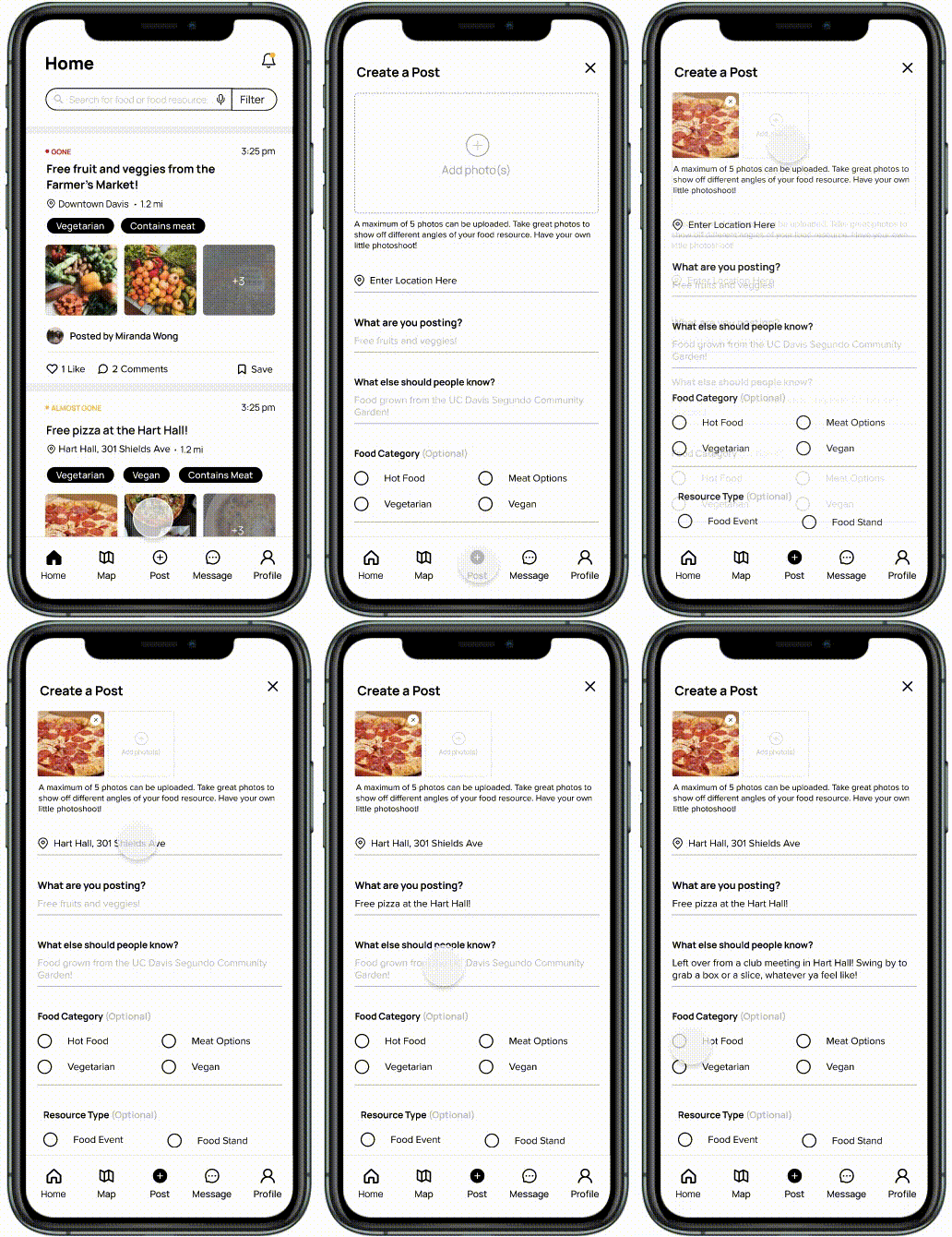
We refined the interface for the home feed to look more visually appealing and added a few key pieces of information that our target audience was looking to see for each post as per our research findings, such as an indication of availability, the location and distance the location was from you, and the ability to add multiple photos per post.
Notifications
We added a Notifications feature to the home page so that people can keep track of messages, comments on posts or updates on posts that they’ve saved.
To filter the types of food posts a user sees, we added a filter with options to filter posts with categories including distance, dietary restrictions and event type (food stand, farmer’s market, food bank, fridge, etc).
Filter
Create a post
It was important to keep the process of creating a food post short and simple to make sharing surplus food quick and easy. Users just need to upload photos (up to 5 instead of just one) to show the food options, add the location and a description of what they’re sharing. They can optionally add more details such as what kinds of food is available, should they choose to. They’re able to edit their posts after sharing as well.
✉️ Messaging
We added a messaging feature to the Freebites app in our redesign to improve the communication experience between food surplus shares/suppliers and students.
We kept the design of it simple and visually appealing to increase user satisfaction during the communication process between food shares and students. We also made it easier to access by adding it to the Navigation bar.
📍Food Map
Adding a resource
We implemented the Food map to make it easier for users to publish new food resources or events on the map, including farmer's markets, community food distribution sites, pop-up food stands and free food fridges (freedges).
👩🏽🌾 Profile
View Saved Posts
The profile page contains the standard user profile and information.
A major aspect of the profile page we wanted to redesign was the saved posts feature, allowing users to reference previous posts they’ve saved so they don’t lose information for a post they’re interested in. Previously, it was too complicated for users to quickly find their saved posts, so we shortened the process.
New Design System
Project Outcomes 💌
Scope and constraints
We had to be strategic as to how we were going to redesign the Freebites interface over the span of 5-6 weeks while also managing our time effectively as full time students. Through effective time management and communication, we were able to use our time together well and make sufficient progress, while also planning out what we could do alone
Impact
Our team was able add new features and redesign existing flows on Freebites to create a more joyful and intuitive experience sharing food on Freebites. Taking part in the redesign for Freebites was an amazing opportunity that showed me the power good design can have in helping to make positive social change. This was my first time working on a project directly with a client and it was a smooth sailing experience working in partnership with Kim and the rest of the Freebites team. I’m thrilled to see our redesign get launched once the product team receives funding from the university and I'm inspired to keep learning and developing my skills so that I can continue to design for good.


